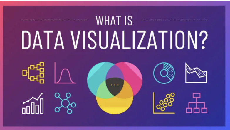
8 data Visualization Best Practices
Data visualization acts as a specialized tool, transforming complex information into easily comprehensible visuals. This article explores the significance of data visualization, particularly in handling large datasets, and its diverse applications.
Additionally, it provides eight tips to enhance the visual appeal of graphs and tables, emphasizing the role of turning intricate data into images to facilitate informed decision-making.
The Significance of Data Visualization in the Big Data Era
In the contemporary digital landscape, the generation of vast amounts of data is a daily occurrence, surpassing the capacity of human cognition. Data visualization serves as a crucial tool, translating extensive numerical data into visually intuitive representations.
Notably, in a single second, the data flow through the internet exceeds the entire storage of the internet two decades ago. The article delves into the role of data visualization in aiding comprehension amidst this data deluge.
Applications Across Various Fields
Data visualization finds widespread utility in diverse fields, including economics, science, technology, healthcare, and humanitarian efforts. In economics, it facilitates the analysis of market trends and strategic business planning.
In scientific and technological domains, it aids in comprehending research findings and fostering innovative ideas. Furthermore, in healthcare and humanitarian initiatives, data visualization assists in resource allocation and decision-making based on data-driven insights.
Principles Guiding Effective Data Visualization
The article outlines fundamental principles for creating impactful data visualizations:
1. Have a Clear Goal: Clearly define the purpose of the visualization, ensuring it addresses vital questions and provides value.
2. Know Your Audience: Tailor visualizations to the audience’s level of familiarity with charts, keeping the presentation simple and accessible.
3. Choose the Right Type: Select the appropriate chart type based on the nature of the data, such as line charts for temporal trends and bar charts for comparisons.
4. Tell a Story: Structure the visualization to convey a narrative, guiding viewers through a coherent beginning, middle, and end.
5. Pick Data Points Carefully: Highlight data points that contribute significantly to the narrative, ensuring accuracy and relevance.
6. Use Visual Hierarchy: Employ size, color, and position to emphasize key elements, guiding attention to critical aspects of the visualization.
7. Labels Matter: Craft clear and concise labels to enhance understanding and interpretation.
8. Test with Users: Seek feedback from real users before finalizing the visualization, refining it based on practical insights.
Conclusion
Amidst the abundance of information, data visualization emerges as a superhero, aiding in the comprehension of extensive datasets. By transforming intricate data into visual representations, individuals can discern crucial insights and make informed decisions.
The versatility of data visualization extends across various fields, empowering professionals to identify patterns and create substantial impacts. When faced with overwhelming data, the transformative power of visualization guides the way, allowing insights to illuminate the path forward.